Designing with AI for Digital Marketing
Moumita Sinha, Jennifer Healey, Tathagata Sengupta
Adobe Inc.
We present an interactive user interface that allows digital marketing professionals to have real time access to insights from a back-end AI that predicts potential click-through rates of composed content based on similar past campaigns. We wanted to investigate the extent to which digital marketing professionals would find our system usable and useful and whether or not the advice our system generated would create content that had higher click through rates than content developed without the system’s advice. Our framework decomposes aspects of prior campaigns into features including image quality, memorability, and placement; and text readability, formality and sentiment. We show our algorithm has high predictive value on a historical test set (AUC .80); that digital marketing professionals give the system an overall high satisfaction rating and that, using the advice of the AI agent, we can generate content that creates up to 22% click-through rate lift on a 700 A/B preference tasks given to master workers on AMT
The Interactive System
Designers begin by choosing one of several different image layout configurations (e.g.the six image layout framework in the left panel), then select from a collection of images available under a different tab on the same panel. When an image is placed in a slot, our back-end AI calculates the overall click-likelihood (shown in the speedometer gauge, top)and the contribution from the individual features, collectively by type in the vertical bar graph and in more detail below using horizontal bar graphs. The designer can optionally add text which is then analyzed, adding additional contributing features. This real-time feature based dashboard allows the designer to make choices that are informed by AI, but allows them to maintain control and use the recommendations interactively and creatively
Creating the AI
We have tried to identify the best available quantifiable features to cover three basic aspects of persuasion: emotional persuasion (pathos); logical argument (logos) and credibility (ethos) which we relate to image quality, composition and text respectively. Pathos: We support the emotional aspect of persuasion with image features regarded as salient by photographers. These comprise: Rule of thirds, Repetition, Depth of field, Balancing elements, Interesting lighting, Symmetry, Vivid Color, Motion Blur, Interesting content, Object emphasis, Color harmony and Quality. Logos: The logical aspect of persuasion is associated with spatial and geometric reasoning. We used two features to represent this: the ratio of each individual image to the total image area and the relative location of the image: top, the middle or bottom third of the layout. Ethos: We used text features to support the aspect of credibility. For persuasion, two important features of text are “plain-spokenness” and positivity. We quantify plainspokenness with features of text readability and text formality and positivity with sentiment analysis. Our text readability features include: average sentence length in words, average word length in syllables and average percentage of personal words. To calculate these we used both a syllable analyzer and parts of speech analyzer (PoS). Our text formality features include the relative counts of parts of speech. Our positivity score comes from a sentiment analyzer. For those images that have no text, we assigned the highest readability score, the lowest formality score and a neutral sentiment.
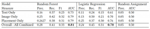
We used the features described above to independently train two different types of classifiers, logistic regression and random forest, to predict how likely a user would be to click on different image, placement and text combinations. We also used a baseline random assignment of click outcome to individuals. Our training data consisted of user responses to a targeted campaigns consisting of over three million emails. Of these, we only had an “email opened” response for approximately two million emails that we could use for training. Table 1 shows the precision, recall, F1 score and area under the curve (AUC) for each of the text, image and placement components separately as well as the overall score, with the overall combined model achieving best accuracy.
Evaluation
Design is a creative act and machine learning algorithms trained on past data can never perfectly predict user response to novel content, however, we wanted to determine whether our predictions were plausible enough for professional designers to find them useful in their design process and to get feedback on the usability of our dashboard. We wanted to evaluate whether or not our feature-based design recommendations actually had a positive impact on click prediction for novel compositions. To answer these questions, we conducted two evaluations: a live test of the system with ten digital marketing professionals and an A/B test of content recommended or not recommended by our AI using master AMT workers.
Expert User Study:
We recruited ten digital marketing professionals to test our prototype system and give us feedback in a structured setting. Each person evaluated the system in a one hour session which included: a tutorial on how to use the system (5-7 minutes) and a marketing email composition task (10-15 minutes). They were told they could use the advice of the AI or not in their design. After the usage period, participants answered the 10 question survey shown in Table 2. Participants had five response choices that we scored as: strongly disagree (-2),disagree (-1), neutral (0), agree (+1) and strongly agree(+2). The score shown below is the average score across all ten users.
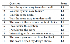
The average scores of the system were very good. We believe that some of scores are skewed high, particularly the answer to question five, because many participants tried to maximize the AI score during the task. While most experts agreed that the scores were useful and that they would use this system to do their job if the system were available. The concerns of those who disagreed with these questions mainly did so out of concerns about the data used to train the system, like the demographic composition of the data used to train the algorithm and whether that matched the target audience. While most of the users were able to use the system with little difficulty, one user commented that the text and layout controls could be easier to use. One user equated design choice with layout choice and thought that this was fixed so he did not see how the score could influence it. Multiple layouts were available, but you had to scroll down to see them. We intend to use these comments to improve both our questionnaire and on-boarding process.
AMT Evaluation:
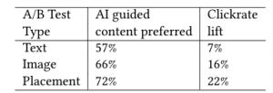
To evaluate the click through lift, we created a series of A/B tests (700 total) and hired 50 master turkers on AMT to evaluate them. Each of the tests featured similar options, one of which our AI would recommend over the other. The Figure below shows two examples of these side by side comparisons, the left pair shows two image choices and the right shows two placement choices. Participants were asked to select the option they found most appealing from each pair. Workers were only allowed to participate once and were asked to complete14 tasks: 5image, 5layout and 4 text preferences. We randomized the task type and A/B pair order within each task for each participant. These experiments were designed to evaluate whether our algorithm’s feature based recommendations on novel content would likely convert to higher click-through rates, a key performance goal in digital marketing.

Table 3 shows the the results of our AMT evaluation. We found that our algorithm’s recommendations had the strongest predicted AMT preferences with respect to the placement recommendation 72% of the time, resulting in a potential click-through lift of 22%. Our system’s recommendations had less predictive impact on image and text recommendations, with respective accuracies of 66% and 57%. But even these lower accuracies still resulted in potential click-rate lifts of 16% and 7%, both of which would likely deliver real value to a campaign.
Conclusion
Our goal in this research was to develop an interactive user inter-face that allows digital marketing professionals to get real-time feedback on the persuasiveness of their compositions in terms of click likelihood predictions, after an email is opened. Because we knew designers would want to work interactively with the system, we wanted to find a framework of features that was easily understandable, usable and useful to our target users. In terms of technical accuracy, our logistic regression classifier had similar performance results both on held out historic data and in A/B preference tests on novel data. In both cases, the algorithm most accurately predicted preference based on placement: 0.76 AUCon historic data, 72% accuracy on novel data. Image preference was the second most accurate with 0.70 AUC on historic data and 66%accuracy in the A/B tests. Text prediction was the weakest with .61AUC on past data and 57% accuracy in the A/B tests. We believe that the placement results were strong because they encode well established principles of advertising, for example that larger images near the top of a document are more likely to be clicked. While the differences can be more subtle for different parts of the layout, the principles are well established. We believe the image recommendations, which encode well established principles of photography, provide less differentiation because there is actually a smaller range of differentiation in the quality of our photos, which are all professionally shot.
Overall, our survey results show that expert users found the system both useful and usable and that the AI recommendations were helpful to them in making their design choices. Although we appreciated the overall positive sentiment, we were actually most interested in hearing the opinions of users who answered that they”disagreed” with any of the survey questions. We appreciated that one user who disagreed that she would use this system for her job went into great detail comparing the features of this system to the features of the tool she was currently using. She called out the limitations of the available templates and image content. She let us know that in the real world content is often restricted by brand and campaign and that it is unlikely that she would often be able to reuse images that had been used on prior campaigns. All users, however, seemed to understand and appreciate the framework of features that were presented to them in the AI dash-board. Many of the terms were familiar to designers with a back-ground in photography and all participants said that they could relate these to aspects of the authoring content.
We showed that the features we calculated performed well on predicting the click potential of a held out test set from a past email campaign and resulted in higher click-through rates on novel content recommended by our system in a series ofA/B tests using master turkers on AMT.
We admit our prototype could be improved in many ways, but we believe that we have presented a novel interactive user interface that incorporates real-time AI insights into digital marketing content design. We have shown both that our system is capable generating useful recommendations that have the potential to increase click rates and that most of our experts found the system both useful and usable.
Paper Link: https://doi.org/10.1145/3386392.3397600
Madness Video: https://www.youtube.com/watch?v=2ag24s42PVw